Results
Level 3 Challenge : Global Winner
Overview
The 2022 Better Working World Data Challenge (BWWDC), aims to tackle some of the world’s biggest environmental and climate change problems. Now in its third year, the competition is split into 3 related challenges :
- Level 1 : Local Frog Discovery Tool
- Build a computational model to identify the occurrence of frogs for a single location using a single data source
- Level 2 : Global Frog Discovery Tool
- Build a species distribution model to identify the occurrence of 9 frog species across Australia, Costa Rica, and South Africa using a variety of open-source geospatial datasets
- Level 3 : Frog Counting Tool
- Build a computational model to predict the count of frogs for a specific location using datasets available on the Microsoft Planetary Computer Data Catalog.
Level 3 of the challenge, unlike the previous 2 allows for a lot of freedom in crafting the solution since you are free to use any dataset available on Microsoft’s Planetary Computer Data Catalog.
There are a few important points to take note as well :
- Only climatic variables can be used.
- You are to build a single model that is able to generalise to differemt climatic conditions in different areas.
I will briefly describe some of the ideas I went through below.
Understanding the Problem
Click Here to go to the Challenge 3 Webpage
The aim of this challenge is to build a Regression model that is well generalised and able to accurately represent the range of distribution of frogs.
The challenge utilises F1-score as its Evaluation Metric. Initially, it is difficult to understand how F1-score is calculated for the regression problem. I hypothesised it checked if the predictions were within a range (leeway) from the actual value and if it was, it was considered a correct prediction, otherwise, it would have been taken as an incorrect prediction.
There could be many reasons to which why this method of evaluation was chosen but I believe it was because the organisers wanted to ensure the consistency of predictions (increase penalty for outliers), which is rather similar to why Mean Absolute Error (MAE) is sometimes switched out for Mean Squared Error (MSE) to somewhat achieve a similar effect (Although they are inherently different).
Before any work is done, it is mandatory to ensure the random seed is standardised.
import random
import os
import numpy as np
import tensorflow as tf

def seed_everything(seed=2022):
    random.seed(seed)
    os.environ['PYTHONHASHSEED'] = str(seed)
    np.random.seed(seed)
    os.environ['TF_CUDNN_DETERMINISTIC'] = str(seed)
    tf.random.set_seed(seed)

seed_everything()
Data Processing and Data Analysis
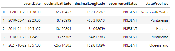
The initial Data provided is a collection of individual frog count occurrences over the past few decades. A snippet of the processed Dataframe can be seen below.
Thankfully EY provided some supplementary notebooks on Data Processing for some of the datasets on the Planetary Computer Data Catalog which allows us to generate the frog counts (target variable).
A Grid Based approach was taken to generate the frog counts. Essentially, a bounding box (Bbox) of a specified area is drawn over the entire area of interest and frog counts are tabulated separately in each Bbox.
We can tell from the above that the number of rows of data is inversely proportional to the size of the Bbox. (The smaller each Bbox is, the more rows data we would be able to get since more Bboxes would be required to fill the entire area of interest). However, this also poses another problem. Although we are able to achieve more rows of data by using a smaller Bbox, the magnitude of frog counts (target variable) would decrease as well, since we are sampling over a smaller Bbox. Hence, it is easy to see that there exists an optimal range of Bbox size such that we are able to obtain sufficient data and the number of frog counts for each Bbox area is not too low as well.
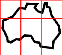
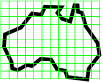
I began experimenting values using a Bbox size similar to that of the areas of interest in the Test Dataset which was 504 sqkm and eventually arrived at an optimal Bbox size of about 25 sqkm.
def country_bbox(country, lat_km, lon_km):
    if country.lower() == "aus":
        aus_whole = {
            "min_lati":-39.398856,
            "max_lati":-10.521216,
            "min_longi":113.062499,
            "max_longi":153.896484
        }
    """
    Note that for South Africa and Costa Rica, I expand the area in which we are
    looking at in order to grab more data, hence the +/- 5 units for min & max lat/lon.
    """
    elif country.lower() == "sa":
        aus_whole = {
            "min_lati":-34.773805-5,
            "max_lati":-22.230311+5,
            "min_longi":16.45-5,
            "max_longi":32.865667+5
        }
    elif country.lower() == "cr":
        aus_whole = {
            "min_lati":8.376218-5,
            "max_lati":10.991875+5,
            "min_longi":-85.47945-5,
            "max_longi":-82.564591+5
        }
    elif country.lower() == "test_aus":
        aus_whole = {
            "min_lati":test_df.iloc[:80,2].min(),
            "max_lati":test_df.iloc[:80,4].max(),
            "min_longi":test_df.iloc[:80,1].min(),
            "max_longi":test_df.iloc[:80,3].max()
        }
    elif country.lower() == "test_sa":
        aus_whole = {
            "min_lati":test_df.iloc[80:154,2].min(),
            "max_lati":test_df.iloc[80:154,4].max(),
            "min_longi":test_df.iloc[80:154,1].min(),
            "max_longi":test_df.iloc[80:154,3].max()
        }
    elif country.lower() == "test_cr":
        aus_whole = {
            "min_lati":test_df.iloc[154:,2].min(),
            "max_lati":test_df.iloc[154:,4].max(),
            "min_longi":test_df.iloc[154:,1].min(),
            "max_longi":test_df.iloc[154:,3].max()
        }

    # 1 km ~ 0.008983 degrees of latitude
    # 1 km ~ 0.015060 degrees of longitude
    bbox_grid_whole = [({
        "min_x":np.round(x,4),
        "min_y":np.round(y,4),
        "max_x":np.round(x + (0.015060 * lon_km),4),
        "max_y":np.round(y + (0.008983 * lat_km),4)})
        for x, y in itertools.product(np.arange(aus_whole["min_longi"],
                aus_whole["max_longi"],(0.015060 * lon_km)),
                np.arange(aus_whole["min_lati"], aus_whole["max_lati"],(0.008983 * lat_km)))]
    return bbox_grid_whole, aus_whole
At this Bbox size, I am able to generate about 10 times more data as compared to using a 504 sqkm bounding box and at the same time, I am able to preserve a large portion of the high frog count, hence increasing the amount of data available for training and maintaining data quality.
The target variable generation helper function is similar to the one used in one of the example kernels for data extractions on the official competition Github page and is as follows :
def generate_frog_count(bbox_grid_whole):
    filt_lat = {}
    i=1
    for _,bbox in tqdm(enumerate(bbox_grid_whole)):
        longi_lati_df_rang = df_frog[((df_frog['decimalLongitude'] >= bbox["min_x"]) &
                                        (df_frog['decimalLongitude'] <= bbox["max_x"])) &
                                        ((df_frog['decimalLatitude'] >= bbox["min_y"]) &
                                        (df_frog['decimalLatitude'] <=bbox["max_y"]))]
        if longi_lati_df_rang.shape[0]>0:
            filt_lat[i] ={}
            filt_lat[i]["coord"] = bbox
            filt_lat[i]["frog_count"] = longi_lati_df_rang.shape[0]
            i=i+1
    aus_whole_filt_cord = filt_lat

    aus_whole_filt_cord_df = pd.DataFrame.from_dict(aus_whole_filt_cord,orient="index")

    aus_whole_filt_cord_df["min_lon"] = [i["min_x"] for i in aus_whole_filt_cord_df["coord"]]
    aus_whole_filt_cord_df["min_lat"] = [i["min_y"] for i in aus_whole_filt_cord_df["coord"]]

    aus_whole_filt_cord_df["max_lon"] = [i["max_x"] for i in aus_whole_filt_cord_df["coord"]]
    aus_whole_filt_cord_df["max_lat"] = [i["max_y"] for i in aus_whole_filt_cord_df["coord"]]

    return aus_whole_filt_cord_df
When generating the data, there is also a temporal element involved. I decided to pull data from the past 14 years in 2 year intervals (e.g 2005-2007, 2007-2009 … 2017-2019) which allows me to expand the data quantity 7 folds as compared to just compiling data from 2005-2019. This is possible as the target variable is tabulated over a period of ~50 years (from 1970s-2020). This essentially means that each of the dataset generated from the 2 year intervals have “less information” than that of the dataset pulled from the entire 14 years or even the whole 50 years interval but at the expense of “quality” there is an increase in the quantity of the data. This somewhat resembles the idea of pseudo labelling, where weak labels are added to the original data and another model is trained on the combined data. Even though these pseudo labels do not have the “quality” of the original data, they still provide additional information that helps more complex models learn more about the data.
To accomplish this, we can simply modify the given functions in one of the example kernels to read from a range of dates.
def get_data(time_range, aus_whole_filt_cord_df, country, aus_whole):
    # Selecting time frame based on frogid dataset
    for i in time_range:
        print(f"Generating Data from {i[0]} to {i[1]}")
        ds_date = ds.sel(time = slice(i[0],i[1]))

        # filtering data for specific region based on coordinates
        ds_aus = ds_date.where(
            (ds.lat>=aus_whole["min_lati"]) &
            (ds.lat<=aus_whole["max_lati"]) &
            ((ds.lon>=aus_whole["min_longi"]) &
            (ds.lon<=aus_whole["max_longi"])), drop = True
        )

        #  Converting the xarray format to pandas dataframe
        ds_aus = ds_aus.to_dataframe().reset_index()

        ds_aus["time"] = pd.to_datetime(ds_aus["time"])

        # Iterate the Terra climate lat-lon across the grids for averaging the terraclimate values for a particular lat-Lon
        for ind,row in tqdm(aus_whole_filt_cord_df.iterrows()):
            longi_lati_df_rang = ds_aus[
                (ds_aus['lon'] >= row["min_lon"]) &
                (ds_aus['lon'] <= row["max_lon"]) &
                (ds_aus['lat'] >= row["min_lat"]) &
                (ds_aus['lat'] <=row["max_lat"])
            ]

            col = [{var:longi_lati_df_rang[var].mean()} for var in longi_lati_df_rang[longi_lati_df_rang.columns[4:]]]

            for var in col:
                for key,val in var.items():
                    aus_whole_filt_cord_df.loc[ind,key] = val

            aus_whole_filt_cord_df.loc[ind,"samples_count"] = longi_lati_df_rang.shape[0]

        dt_one = i[0].split("-")[0]
        dt_two = i[1].split("-")[0]

        aus_whole_filt_cord_df.to_csv(f"{dt_one}to{dt_two}_Terra_{country}_grid_bbox_25sqkm.csv", index=False)
And we can simply run the above functions to generate datasets for a series of dates ranges / time intervals like this
import math
lat_km = math.sqrt(25)
lon_km = math.sqrt(25)
country_list = ['aus', 'sa', 'cr']
time_range = [
    ["2005-11-01","2007-11-01"],["2007-11-01","2009-11-01"],
    ["2009-11-01","2011-11-01"],["2011-11-01","2013-11-01"],
    ["2013-11-01","2015-11-01"], ["2015-11-01","2017-11-01"], ["2017-11-01","2019-11-01"]
]
for country in country_list:
    bbox_grid_whole, aus_whole = country_bbox(country, lat_km, lon_km)
    aus_whole_filt_cord_df = generate_frog_count(bbox_grid_whole)
    get_data(time_range, aus_whole_filt_cord_df, country, aus_whole)
In this case, the additional data was pivotal in allowing more complex models (Neural Networks and Gradient Boosted Trees) to converge.
After Data generation, I proceeded to plot the frog count (target variable) distribution of the 3 countries of interest (2005-2007):
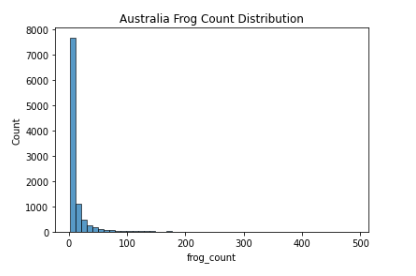
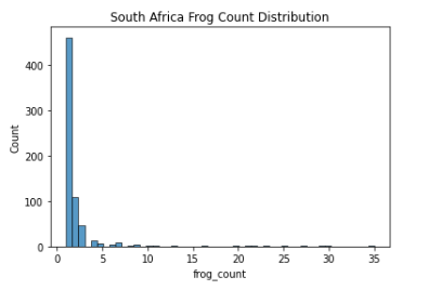
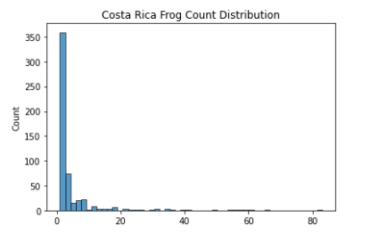
As seen above, the data mimics a right half of a normal distribution (or a normal distribution with mean 0 and all values > 0). Since about 75% of the values are all 1’s (Low Frog Count Density), we have to be careful not to let the model overfit to this lower distribution of frog count.
After some simple modelling, I decided to check if the test dataset distribution is similar to that of the train dataset distribution. This is done by submitting predictions of all 1’s as predicted frog count variables. I was able to achieve a Public Leaderboard (LB) score of 0.24, which was significantly higher than some of the baseline scores I was getting (~ 0.10). This is enough evidence to suggest a similarity of data distribution between the train and test dataset, which is good news.
However, this also means that my previous hypothesis of how the F1 Score on the LB was calculated is wrong. The huge difference in scores between model predictions and predictions with all 1’s likely suggests that the F1 Score is calculated to check for a correct prediction with no leeway at all. This means a prediction 1 unit off the actual value and a prediction 99 units off the actual value are both equally penalised. Hence, instead of what I thought was a hybrid MAE/MSE kind of Evaluation Metric, was actually probably an Evaluation Metric to measure the accuracy of model predictions for the lower end of frog counts. Essentially, the Evaluation Metric suggests how accurate your model is for lower end frog counts since it is exponentially more difficult to be able to predict the presence of 248 Frogs in a certain area as compared to 1 Frog in another (because of the data distribution).
Hence, in order for the model to be able to better represent the range of frog count distributions, I decided to use my own Evaluation Metric to generate Cross Validation Scores. This will be discussed later in the Evaluation Metric section.
Model Choice
Before any in-depth experimentation, a simple comparison between model candidates was done. The results are evaluated by Mean Absolute Error (MAE).
| Model | MAE |
|---|---|
| ANN | 9.357 |
| XGBoost | 10.950 |
| Lasso Regression | 13.942 |
Additionally, I decided to plot the distribution of predicted frog counts of all 3 models and compare it with the distribution of the training dataset. For simplicity’s sake, only the distribution of Australian Data (2005-2007) is represented here
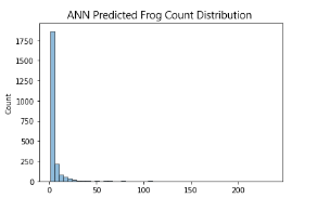
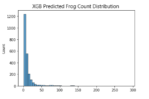
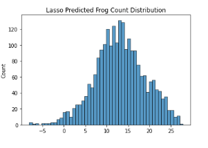
Given the complexity of the problem, Linear Models are unable to generalise well.
What’s more interesting here is how the Artificial Neural Network (ANN) is able to perform slightly better than XGboost (XGB). In my experience, Gradient Boosted Decision Trees (GBDTs) usually perform better than Neural Networks (NNs) in tabular data problems, especially so as the complexity of data increases.
I predict that its likely NNs are better able deal with the interesting data distribution that we are working with, since the LB scores of the ANN model are consistently better than that of the XGB model (This likely means ANN is better at predicting the lower end of frog counts or XGB is worse at generalising lower magnitude frog count numbers). However, this difference in score could also be attributed to overfitting of the NN. This is examined later by comparing CV and LB score deviations and trend, simple checking of loss curves, and plotting out our model predictions on the world map.
Note that I only touched on XGB when talking about GBDTs here. Other GBDTs like Catboost, LightGBM etc … perform worse than XGB or are simply not suitable for this specific problem. The performance of LightGBM is extremely dependent on Data Quantity and with the limited training data that I am able to generate, it unfortunately still underperforms heavily. As for Catboost, XGB just performs better for this specific problem.
I decided to work on NNs in the end due to its superior performance over GBDTs. The hidden layer and neurons in the NNs are briefly adjusted/tuned after simple manual trialling by adding and removing layers and neurons. This method is chosen over a more conventional Bayesian Optimisation technique as we are trying to achieve a generalised model and not an optimised model for just predicting frog counts in Australia, South Africa and Costa Rica only.
Feature Selection & Engineering
Since we are free to use any data available on Microsoft Planetary Computer, I collated some of the data catalogs I deemed useful, some examples include : ESRI Land Cover Data, JRC Global Surface Water, Sentinel-2 and Sentinel-1 Data Sets etc …
I then proceeded to create statistical aggregations (e.g mean, median, standard deviation, kurtosis, frequency, etc …) of all these variables. Then, I generated more features based on feature interactions of features with a similar unit of measurement (e.g max temp - min temp = temp range etc …). For categorical data, a variety of encoding techniques were attempted, including target encoding, one hot encoding, label encoding, mean encoding etc … Eventually I settled on a simple label encoding.
Feature selection was then performed using Recursive Feature Elimination (RFE) where the worse performing feature was dropped after every iteration. This is done over a series of random seeds to ensure greater accuracy. Alternatively, Permutation Importance can be used in place of Recursive Feature Elimination but because of time constraints, I implemented only the latter instead.
### Python Pseudo-Code for RFE

from tqdm import tqdm

feature_columns = [i for i in X_train.columns if i != 'target_variable']
iterations = 5
for _ in range(iterations):
    for feature in tqdm(feature_columns, position=0, leave=True):
        temp_feat = feature_columns.copy()
        temp_feat.remove(feature)

        # Build Model
        model = build_model()

        # Fit Model
        history = model.fit(X_train[temp_feat], y_train, validation_data=(X_test[temp_feat], y_test), epochs=X, batch_size=Y,
                            verbose=0, callbacks=[A, B])

        # Store MAE
        mae_store = []
        mae_store.append(history.history["val_loss"][-1])

    print("Best MAE :", min(mae_store))
    print("Feature Scores :", mae_store)

    if min(mae_store) >= default_mae:
        print("RFE Done")
        break
    else:
        default_mae = min(mae_store)
        print(f"Dropping {feature_columns[mae_store.index(min(mae_store))]} Column")
        feature_columns.pop(mae_store.index(min(mae_store)))

    print("Final Columns Length :", len(feature_columns))
    print("Final Columns :", feature_columns)

### This is then done over a series of random seeds and results are averaged
The data is then passed through a Min Max Scaler before feeding into the final model.
Evaluation Metric, Cross Validation and Loss Function
Evaluation Metric
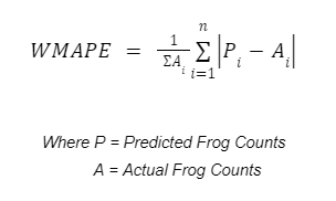
I decided to evaluate my models on a Weighted Mean Absolute Percentage Error (WMAPE).
Since I intend on using a KFold Cross Validation of some sort, I decided to use a Metric that takes into account the mean of the validation set since it’s going to vary across the different folds. I felt the use of this Evaluation Metric would complement the Evaluation Metric used on the public LB and as an individual metric, would serve to better track my model performances as compared to the F1-Score used on the LB.
As briefly discussed before, the F1-Score used on the LB provides good information on how good the model is at converging on lower frog count distributions. This means that we need another way to check if the model can maintain its performance at higher frog count numbers. This is done by setting a lower limit threshold (i.e 10 frogs) and evaluating the WMAPE on the set of data that has its frog counts above this threshold and comparing it with the overall WMAPE score as a whole, this value for my final submission revolved around 1.1 - 1.2 times the overall WMAPE score calculated which I felt was satisfactory.
Cross Validation
A simple 5 Folds Grouped CV was implemented to ensure the data is evenly split across all folds. The scores across the 5 folds are as follows :
- Fold 0 WMAPE - 0.683
- Fold 1 WMAPE - 0.694
- Fold 2 WMAPE - 0.683
- Fold 3 WMAPE - 0.700
- Fold 4 WMAPE - 0.696
Interestingly, because of the imbalance of data for the 3 different areas, the default GroupKFold function in sklearn does not work as intended. Below is a simple implementation of the CV used.
# Python Pesudo-Code for CV Implementation

class CFG:
    ...
    ...
    seed=2022,
    ...
    ...

fold_store = {
    "fold_0":{
        "aus":[],
        "sa":[],
        "cr":[],
    },
    "fold_1":{
        "aus":[],
        "sa":[],
        "cr":[],
    },
    "fold_2":{
        "aus":[],
        "sa":[],
        "cr":[],
    },
    "fold_3":{
        "aus":[],
        "sa":[],
        "cr":[],
    },
    "fold_4":{
        "aus":[],
        "sa":[],
        "cr":[],
    },
}

from sklearn.model_selection import KFold

skf = KFold(n_splits=5, shuffle=True, random_state=CFG.seed)
for i, (train_index, test_index) in enumerate(
    skf.split(aus_train.loc[:,[i for i in aus_train.columns if i != "frog_count"]],
    aus_train["frog_count"])):

    fold_store[f'fold_{i}']["aus"].append(train_index)
    fold_store[f'fold_{i}']["aus"].append(test_index)

skf = KFold(n_splits=5, shuffle=True, random_state=CFG.seed)
for i, (train_index, test_index) in enumerate(
    skf.split(sa_train.loc[:,[i for i in sa_train.columns if i != "frog_count"]],
    sa_train["frog_count"])):

    fold_store[f'fold_{i}']["sa"].append(train_index)
    fold_store[f'fold_{i}']["sa"].append(test_index)

skf = KFold(n_splits=5, shuffle=True, random_state=CFG.seed)
for i, (train_index, test_index) in enumerate(
    skf.split(cr_train.loc[:,[i for i in cr_train.columns if i != "frog_count"]],
    cr_train["frog_count"])):

    fold_store[f'fold_{i}']["cr"].append(train_index)
    fold_store[f'fold_{i}']["cr"].append(test_index)
Loss Function
Surprisingly, I spent lots of time deciding the model’s loss function. Because of the (negative log-like) data distribution, a Root Mean Squared Logarithmic Error (RMSLE) loss function seemed initially suitable for the NN. However, it is difficult to tell from the loss curves and CV results, when compared to other loss functions for regression analysis, which loss function was better.
I ultimately settled on RMSLE and MAE (Since my Evaluation Metric was based around MAE as well) and did some loss curve and CV comparison.
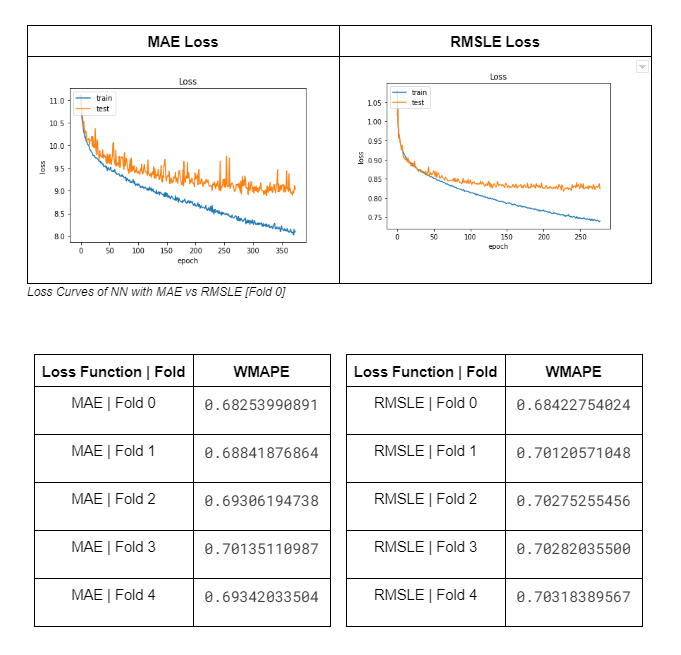
Of course, the CV scores of the model with MAE as its loss function is better since the Evaluation Metric used is based on MAE and the loss curve of RMSLE seems smoother because the variables are logged. It was difficult to see initially which model was actually better and I didn’t want to be blindsided by individual factors so I decided to plot prediction heatmaps to see the different distributions of model predictions.
Below is an example of the heatmap dstribution surrounding an area of interest (area where there should be high density frog count) in Australia (Fold 0) plotted using folium.
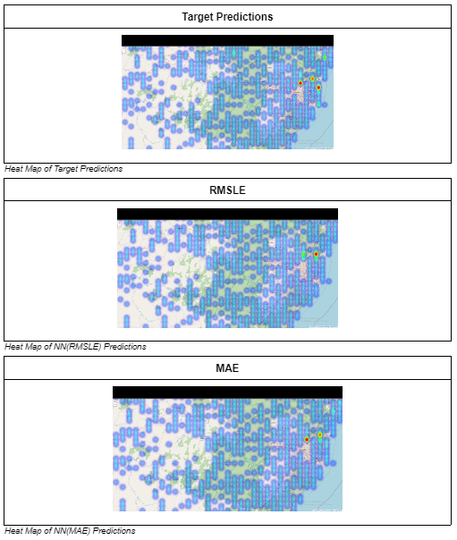
As stated before, it is important that we ensure our model is able to predict high density frog counts accurately as well, hence areas of interests where there are supposed to be high frog count densities are marked out and compared across models with the 2 loss functions. In most cases, like the one above, the predictions of the model with MAE as its loss function is better able to identify the areas with high frog count density as compared to the one using RMSLE and hence the final model uses MAE as its loss function
Conclusion
I want to thank EY for organising a great competition. I especially enjoyed the Data Collection part at the start and the summarisation segment at the end. This made it feel somewhat similar to handling real life AI projects.
Given that this is my first competition after a 3 month burn out, I think the process of trying to find a better or more meaningful solution has allowed me to rediscover the passion that I had for Data Science. I truly enjoyed the process of sharing my insights and I hope you enjoyed reading this as much as I did writing it.